Component Examples
- Content Placeholder. This is typically the first component you
add to a page. This creates a white background for other components.
You add new components within in it.
- Elevator Carousel. We are planning to discontinue this component and removed the example from this page. Industry research and our own analytics show they are not effective at task completion. We discourage adding any new ones.
- Title
- Text
- Text & Image
- Image
- List
- YouTube Video
- External (embeds)
- Table
- Column Control & Columns
- FAQ and Accordion Option
- Tile Icon
-
Column Flexible (with tile
icons)
- Card
- Column Flexible (with images)
- Image Carousel, horizontal
- Text and Media
- Button Dropdown and Button Styled
- Facebook Feed
- X ( formerly Twitter) Feed
Title component
The title will typically be the first component you drop in the content placeholder.
Text component
The text component will likely be the one you use the most. Below are examples of the heading options and other styles you'll find in the editor. Use the system heading styles. Don't substitute things like all caps or images of text.
Paragraph text. This is the default style.
Heading 1
Heading 2
Heading 3
Bold
Italics
Underline. The text editor allows underlines but avoid using them since online that is associated with a link.
This is a hyperlink that is a relative link (for pages
within AEM, e.g. /content/sdc/hhsa.html).
Don't forget the
initial "/"

This is a hyperlink that opens in a new window (for links to external websites, e.g. https://www.cdc.gov).
Don't forget the "https://"
This is a hyperlink that links to a place (an anchor) on this page: Anchor 1.
Lorem ipsum dolor sit amet, consectetur adipiscing elit. Morbi varius commodo ullamcorper. Quisque egestas vitae velit quis scelerisque. Pellentesque vel egestas orci, in luctus augue. Aenean sollicitudin orci a ante ullamcorper, vitae maximus ante commodo. Nullam dolor justo, euismod at metus ut, rutrum ornare purus. Donec molestie ut ex porttitor fermentum. Mauris lacinia ex lobortis augue pretium cursus. Sed elementum tristique felis, quis lobortis nibh imperdiet vitae. Integer placerat ex sed ex porttitor sollicitudin. Vivamus rutrum massa nec lacus pharetra, eget ullamcorper metus congue. Vivamus malesuada ligula eget leo egestas faucibus. Suspendisse consectetur, mi ut volutpat interdum, nisi justo luctus ligula, et faucibus tortor erat a lacus. Curabitur tempus mollis dapibus. Integer sed pharetra neque. Duis convallis condimentum ex et egestas.
- Lorem ipsum dolor sit amet, consectetur adipiscing elit.
- Pellentesque at augue aliquam, suscipit odio nec, auctor nisi.
- Morbi tincidunt orci id felis tincidunt, ac pharetra nulla commodo.
- Vestibulum luctus dui ut leo faucibus faucibus.
- Suspendisse accumsan enim a posuere accumsan.
Anchor 1
- Lorem ipsum dolor sit amet, consectetur adipiscing elit.
- Pellentesque at augue aliquam, suscipit odio nec, auctor nisi.
- Morbi tincidunt orci id felis tincidunt, ac pharetra nulla commodo.
- Vestibulum luctus dui ut leo faucibus faucibus.
- Suspendisse accumsan enim a posuere accumsan.
Text and image component
Text and Image
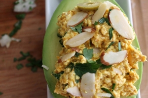
Text & Image Components can be Left or Right aligned. Images can also be hyperlinked.
Remember to always provide Alt Text!
Lorem ipsum dolor sit amet, consectetur adipiscing elit. Nam porttitor, est nec mollis malesuada, turpis diam feugiat lacus, at accumsan est nulla eget enim. Aliquam at varius ante. Nullam nec dictum leo. Vestibulum euismod feugiat quam, eu lacinia metus fermentum at. Duis quis nisl diam. Donec in dictum mi. Nunc sollicitudin dui nec fermentum molestie. Curabitur ligula ex, accumsan at efficitur ac, egestas varius leo. Praesent lobortis id orci tempor convallis. Nullam id placerat odio. Fusce placerat ex vel luctus euismod. Aliquam eu nulla in orci accumsan elementum ac sit amet nibh. Duis id tellus id lacus fringilla consequat in non sem. Mauris iaculis vitae tellus ut vulputate.
Aenean malesuada nisi in eros mollis, a mattis ipsum blandit. Fusce sollicitudin, magna sit amet tempor ullamcorper, tortor justo consectetur erat, id iaculis erat tellus non sapien. In nec convallis metus, in interdum turpis. Praesent tempus, lectus in vestibulum tempor, dolor odio facilisis neque, vel condimentum arcu lectus sed purus. Morbi at justo fringilla, cursus risus eu, pretium nunc. Cras a risus consequat, luctus mauris et, fermentum purus. Donec faucibus interdum dui, eu fringilla velit vestibulum a. Aenean purus purus, porttitor eu mauris tempor, volutpat molestie eros. Curabitur nec odio non ex sodales ornare. Mauris consectetur sapien massa, id rhoncus mi lobortis id. Morbi vel elit id tellus feugiat consectetur fermentum vel nulla. Aliquam tristique ante ac mi convallis, nec ornare magna efficitur. Maecenas arcu sapien, viverra in luctus id, condimentum blandit nibh. Nullam mollis leo nec odio pretium, id convallis nisl convallis.
Image Component
Do not build text into images.

List component
List Components can be used to automatically list child pages of a parent folder or fixed lists the can be sorted easier than an inline list of a Text Component. The example below lists the last 5 child pages sorted by date modified.
YouTube Video Component
Full content-wide
Width: 100%
Height: 428
External Component
Use for iframe objects, such as a Google map.
The component is meant to create the iframe code. Depending on the code you get from an external site, you may need to manually remove all but the url itself.
Table component
Use a table component rather than the table option within the text editor. The table component should resize better for mobile.
| Header 1 | Header 2 | Header 3 |
|---|---|---|
| Cell 1 | Cell 2 | Cell 3 |
| Cell 4 | Cell 5 | Cell 6 |
| Cell 7 | Cell 8 | Cell 9 |
Table Component Tips:
- 3 columns maximum
- No fixed pixel widths
- 4px of cell padding
Mark headings for accessibility
In the cell properties, mark your heading cells as Heading. They default to Data. People using screen readers rely on the proper heading markings to read the table.
Column Control & Columns Component
Column 1

Column 2

Column 3

FAQ without configuration options
-
Question 1
Answer 1
-
Question 2
Answer 2
-
Question 3
Answer 3
-
Collapsible Group Item #1
Lorem Ipsum is simply dummy text of the printing and typesetting industry. Lorem Ipsum has been the industry's standard dummy text ever since the 1500s, when an unknown printer took a galley of type and scrambled it to make a type specimen book. It has survived not only five centuries, but also the leap into electronic typesetting, remaining essentially unchanged.
-
Collapsible Group Item #2
There are many variations of passages of Lorem Ipsum available, but the majority have suffered alteration in some form, by injected humour, or randomised words which don't look even slightly believable. If you are going to use a passage of Lorem Ipsum, you need to be sure there isn't anything embarrassing hidden in the middle of text.
-
Collapsible Group Item #3
All the Lorem Ipsum generators on the Internet tend to repeat predefined chunks as necessary, making this the first true generator on the Internet. It uses a dictionary of over 200 Latin words, combined with a handful of model sentence structures, to generate Lorem Ipsum which looks reasonable. The generated Lorem Ipsum is therefore always free from repetition, injected humour, or non-characteristic words etc.
FAQ, Bordered Style - aka Accordion
The FAQ component has an option to create what's known as an accordion. An example set is below. The individual items describe how to use this component.
-
When to use accordions
Accordions are a way to provide headings without showing all the accompanying text. They allow users to more easily scan a page and get details only when it is relevant to them.
Use accordions only when the text applies to small numbers of users. If most people need the information, leave it in a standard text component.
-
How to create an accordion
Add component. Under SDC section, choose FAQ component.
Under Properties tab, add individual items, headings and text.
Under Configuration tab:
- Check box for Remove Expand and Collapse Feature (recommended)
- Change Style to Bordered. This will open a color options dropdown. Default is black.
The color option affects all items within one component. If you want an accordion of a different color, you need to add a separate component.
-
Recommendations
Be judicious in using color options. Different colors may help indicate thematic groups. Having each item be its own color for its own sake adds visual stimuli that reduces scannability.
We recommend checking the box to Remove Expand and Collapse Feature. If every section around a topic should be opened at once, there's not really a reason to have them be in separate accordions.
As with all headings, keep them as short as possible. FAQs don't need to be literally in the form of questions. Showing as headings rather than full questions reduces reading and improves scannability.
Column Flexible Component
- 3 columns
- No padding
- Tile Icon Component in each columns
Card component
The card component combines an image, a title and an optional description text into one unit that together acts as a link. You cannot make portions of text into a separate link.
The cards should balance the height across a row even if they have different amounts of text.
When to use
Card components are a way to highlight a few destinations users are seeking. You would typically use them on a home or landing page with a lot of subpages.
Cards are a tool to helps differentiate the most-popular links from less popular. You probably want to have no more than 6 cards on a page. Don't make every link a card.
How to use
- Add a flexible column component. Generally limit this to 2-column or 3-column. On desktop, 2-column images will be larger than 3-column. On mobile, all cards become the same size.
- For each column, add a card component. NOTE: Use a new flexible column component for each row.
- For each card, drag an image from the sidekick. It will crop to 16x9.
- Add a title. Optionally, add description text.
Things to watch for
Choose images appropriately.
- They will crop. Make sure it looks good at the cropped size.
- Consider the image at mobile size. Avoid very complex images.
- Don't use images of a flyer or text built into graphics.
Description text is optional. However, use a grouping of cards consistently. Don't have some with headline only and others with headline and description text.
There are no character limits for headlines or descriptions. Use good judgment.
Extremely long words may cause display issues. We tested for a variety of long words and device sizes, but may have missed some scenarios. If you notice issues, contact digital@sdcounty.ca.gov.
2-column, with description text
3-column with description text
3-column, no description text
Watch out for these
3-Column Flexible Component with Images
- 3 columns
- Normal content padding
- Adaptive Image and separate Text component in each column
2-Column Flexible Component with Images
- 2 columns
- Normal content padding
- Adaptive Image and separate Text component in each column
Text and Media Component
- YouTube video
Mobile view size:
- Width: 600px
- Height: 338px
- YouTube Position: Top Centered
Text and Media Component
- Image file
Button Dropdown & Button Styled Components
Column Flexible Component
- 2 columns
- Column padding normal
Button Dropdown & Button Styled components
Facebook Feed Component
Does not work on side rail area due to FB size compatibility issues
X (formerly Twitter) Feed Component
We should no longer use this since X now requires someone to have an account and be logged in to get an updated feed.
Text & Image component

Text & Image component
Needs center alignment style option
Adaptive Image Component
Pink dahlia flower


